Catalyst's Builder Dashboard is the first destination for Builder, a tool designed to ease grant management and creation for non profits, this was the first step in creating a better experience for users from previous iterations. The goal was to make the Dashboard more effective at its original purpose, creating a less stressful experience for already stressed out small to medium sized non profit grant managers. I led the design process from user research to finalizing prototypes, focusing on creating a less-muddled experience for users.
Dashboard
Overview
Problem
The previous version of the Builder Dashboard system had a lot going on, no clear sense of brand, and redundant features that muddled the composition of what was supposed to make it useful. Instead of being a first-glance at the grants an organization were bulding and managing, it became an overwhelming experience for those already overwhelmed at non profits.
Our goal was clarity and simplicity, and this was not being reached. So, we got real feedback from users, and streamlined accordingly.
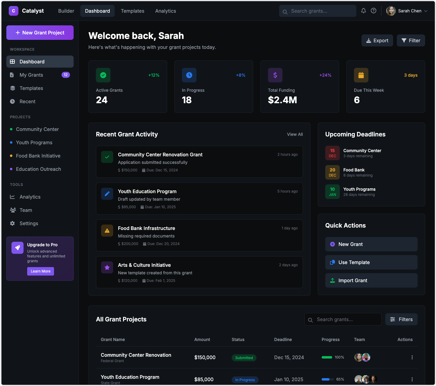
Previous dashboard version.
Research
I wanted to get a good sense of how our users were feeling about the current configeration of the Dashboard. Interviews with these users seemed like a great way to get a feel for this. A panel of questions were initially spun up to gauge where they stood. And I kept coming back with more questions, iterating on the previous design, as well as conducting usability tests to see if key functionality was kept intact.
We found out some cool things:
More than one way to do something isn't always utility.
A lot of the users during tests were confused without guidance, they kept second guessing what they were doing because it felt like there were too many ways to do one thing.
Lack of brand had sown distrust.
From a design perspective, we felt this issue too. The intial iteration was so concerned with functionality, a lot of our brand image that made the user feel comfortable got lost.
Metrics can be stressful.
In trying to convey as much information as possible, some users felt inadequate. In already being stressed out by deadlines, they felt like they were also trying to constantly keep up with performance. This was indicated by numbers such as "x% more funding this month". This made some feel like they were constantly striving to reach a better number, ruining morale when it dropped.
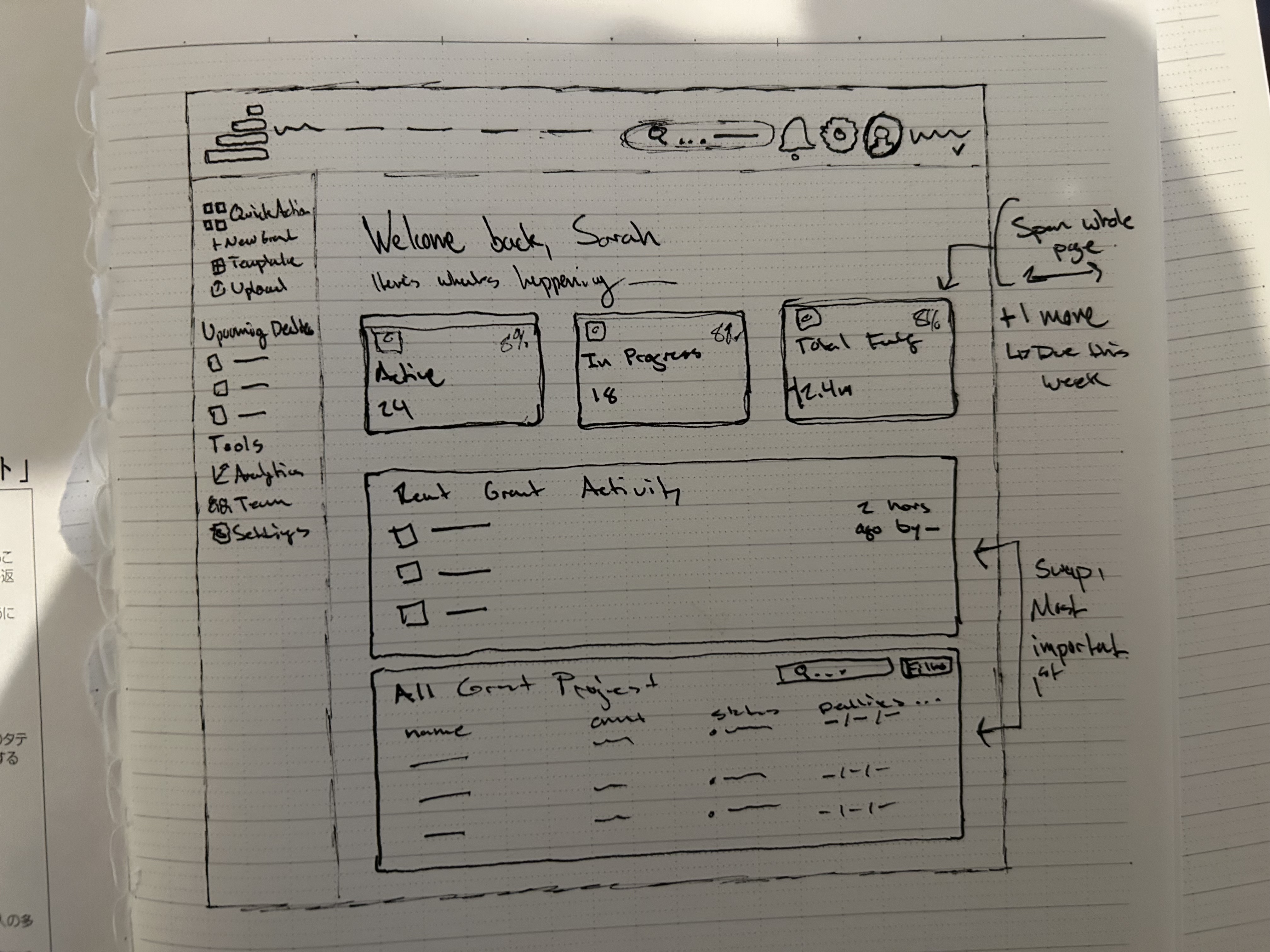
Sketched wireframe
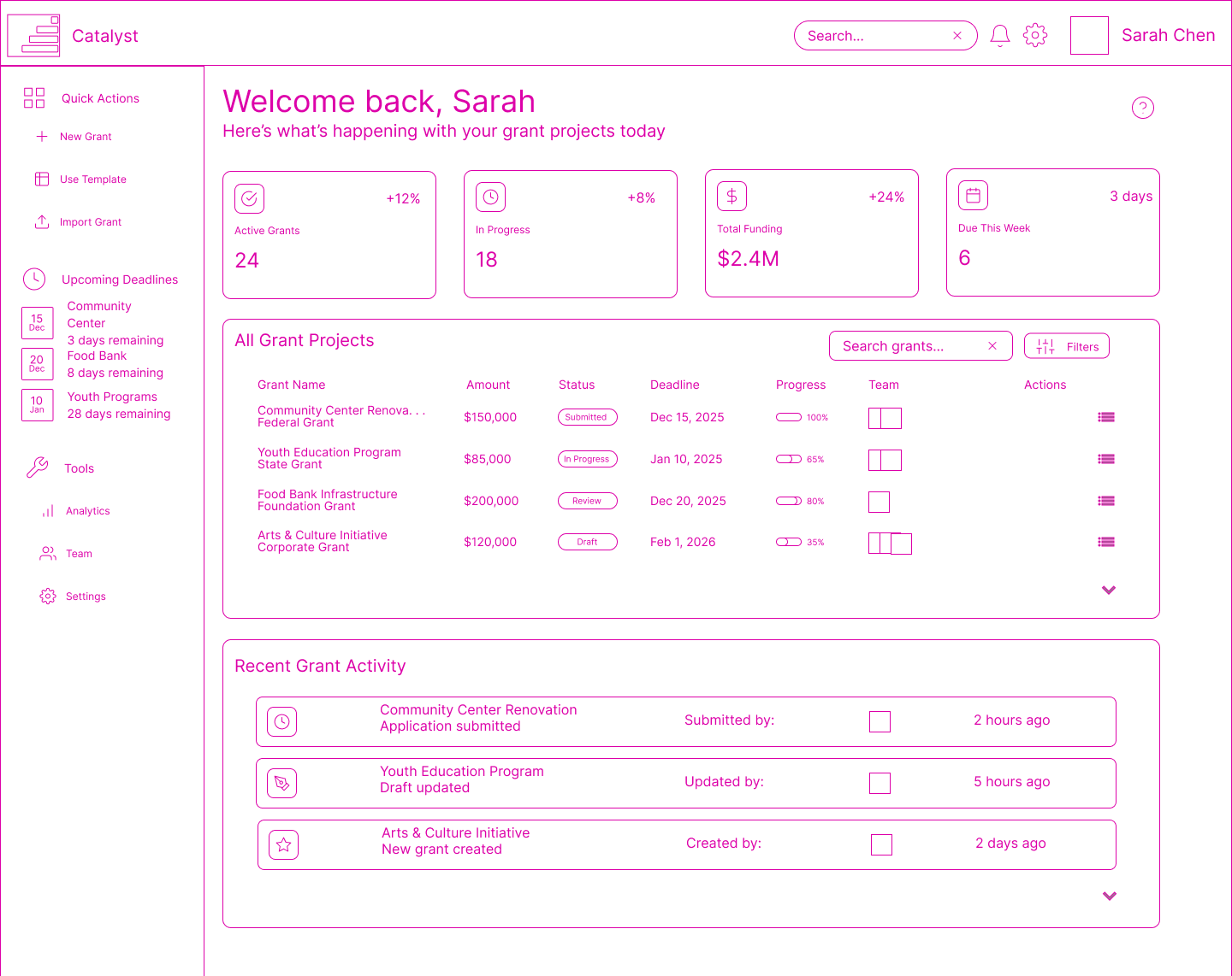
Really cool, pink digital wireframe
Principles
Post-research, and in creating the wireframes, I wanted to come up with a few key principles that would drive the design process. This way we could lay the foundation for what we wanted the Builder experience to be, as this would be the starting point for it all. And hopefully with these in mind, they would become a keystone in iterating on the rest of the tools and pages within Catalyst. The ones which landed I believe will really do a good job:
01
A soft experience
Writing and managing multiple grants at a time can be daunting; I wanted to create a space that is safe and enjoyable for every user, encouraging them. Not one that builds pressure with each sense of progress.
02
Encourage learning
I know our users very well, in interacting with them weekly, you cannot help but trust them to learn and adapt. As this is the very core of what they work for. So, we wanted to encourage them by keeping interactions small, and curiosity high.
03
Prioritise collaboration
These companies are built on the experience and expectation of working together towards a common goal. I wanted to highlight the availability of this in the platform whenever possible. This will become a large driving factor in many other tools of Catalyst.
Outcome
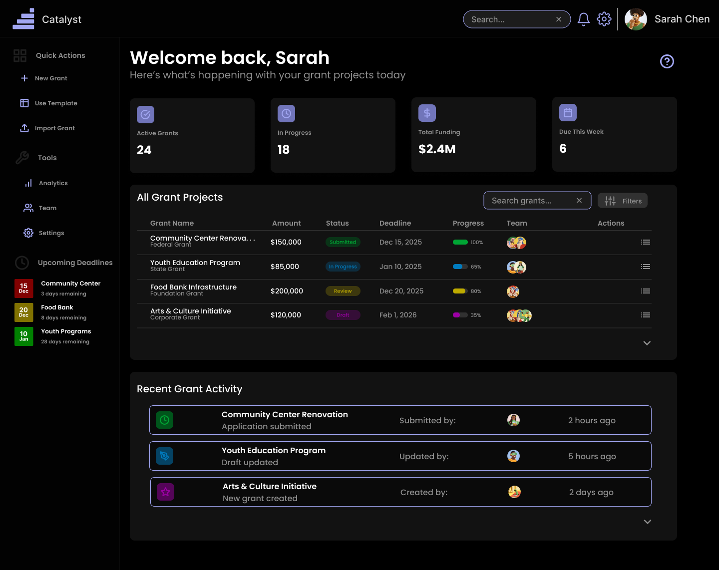
Previous dashboard version.
In this final iteration, we received lots of positive feedback. For one, people were excited to see the Catalyst branding built upon the page again, with a solid design system in place, this built back a lot of trusting feelings. Most notably, we stacked the content and streamlined the amount of interactions. This way it doesn't feel as busy, and everything has its own individual purpose. For the interactions, however, this does not mean we lost functionality. We built this into the micro-interactions around the dashboard, where trust our users curiosity, but still offer help when needed in a non-overbearing, and subtle way.
Key Learnings
The most important insight: complexity doesn't require complicated interfaces. By deeply understanding the people and building thoughtful defaults, we created a system that handles key content and navigation while feeling simple to use.
Design systems are only valuable if they serve the work. The component library became a tool for thinking about consistency and patterns, not just a collection of UI elements.